So you’ve probably noticed the content has been a little slow this summer. Some of that’s because Hail to the Victors 2017 is taking up my life, but the other huge summer project is rebuilding this site from the ground up.
THE DEVELOPERS
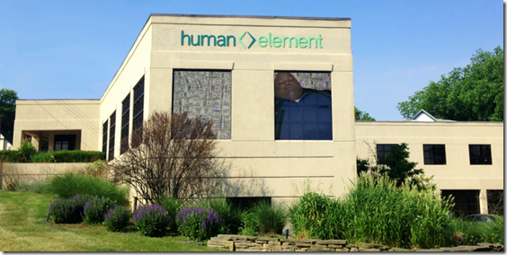
We’ve been working with a local outfit named Human Element. You’ve probably passed by their Kerrytown office at the corner of Detroit and Beakes (and Division and Summit and Carey and High and… you know the junction) a thousand times. Unlike our previous attempts at redeveloping the site they’re established enough to have a team and a schedule they’ve actually managed to stick to.
We’ve insisted they go by “HUEL” for obvious reasons.
Despite all the curveballs we could come up with from a 10-year-old site on a no longer supported platform, this is happening, and on time. I can’t recommend these guys enough.
THE NEW LOOK
Since we’re deep into the design phase, we saw no reason to keep it to ourselves. So here’s a preview of what we’re sort of going to look like in a couple of months (click each to see a larger size):
Normal front page |
Front page when we have a major feature | Inside an article |
|---|---|---|
 | _5.png) | _5.png) |
Let me say a few things about what you’re looking at:
- No that’s not the header. That’s something one of the HUEL guys whipped up in 30 seconds. We’ve engaged MonuMental to design the new official header. That’s still in the works but his initial thoughts are encouraging:
How about Harbaugh as Conan the Barbarian on a mountain of his enemies' skulls (helmets) with background landscape and Easter eggs inspired by the last few years (Florida palm trees, Rome skyline, stacks of milk bottles) and a snarling oversized Wolverine as his companion?
Open to suggestions about what he is wielding overhead. Maybe a football exploding with light and lightning?
- It’s going to be a lot wider, since screens have become so.
- The front page has two modes. Normally there will be some boxes on the top with the latest football article, the latest recruiting article, the latest podcast, and a t-shirt or HTTV something from our store or our top sponsor UGP—these boxes will change based on whatever’s going on at the moment. When we have a featured article (e.g. UFR) it goes to mode 2, with the feature dominating the top and the boxes taking a break.
- Diaries and the Board are staying put, but your login is moving to the upper-right.
- The comments will be threaded into boxes, but after a 5 boxes they’ll stop shrinking and just appear underneath. You’ll be able to minimize a box to hide a part of the conversation and focus on the one you’re having.
- Some users will have little icons next to their names. These will signify things like this person is the OP, or one of our staff, or a moderator, or trusted contributor. Still deciding on how many badges we need—might just be site personnel and hot users (people who recently got a lot of upvotes in that thread).
- Your MGoPoints should carry over to the new site. Apparently the 3rd party module for that hasn’t been upgraded to Drupal 8 so we may have to create our own, but if it’s possible it will happen.
- We’ll be moving to a new server that should be able to handle a much greater load, so this place won’t become a disaster during high traffic events.
- Apps will be brand new and better integrated.
Your feedback is most welcome—we’re building this for you.
