[Ed: BUMP]
A moment comes when you first start listening to minimalist music—for some people it comes quickly, for some people it never clicks at all—when your perception of time changes. As a musician famously described his first exposure to a Philip Glass opera; his initial boredom was transformed as...
I began to perceive...a whole world where change happens so slowly and carefully that each new harmony or rhythmic addition or subtraction seemed monumental...
...he said as the rhythmic woodblock...no, it's Adams not Glass...the woodblock crack of the pulling Stanford guard's pads as he thumped the Oregon SAM out of the hole play after play after play after...
NO! I will NOT spend my Thursday evening in an altered state of consciousness. So I started using the media timeouts, and then the time between plays (well, at least when Stanford had the ball, which thankfully was just about always) to work on a project I'd started a few days earlier during the Gameboy diaries, pulling participation reports for all 125 FBS teams and pulling roster/bio information to get the classes of their starters on the o-line.
And some of you people think huddles serve no purpose.
Honestly, the Horse Wasn't Dead When I Started
The results are here, usefully tabled in a spreadsheet to save some work for the next sap that starts on one of these projects.
Of course, as I sat down at my computer to do some regression analysis on the data I opened the blog and saw Gandalf's diary covering most of what I was planning to do (and doing a better job of it I might add). But I was taking a slightly different tack and found a couple of wrinkles, so for the sake of the eight of you that are still interested I'll continue on....
First a couple of comments about the dataset (feel free to skip the rest of this section, but it might be important if anyone uses the data for further analysis). Gandalf took his data from depth charts at the ourlads.com scouting site; mine come from the starting lineup listed in each school's participation report in the official game stats for their most recent game against FBS competition (sometimes coaches play with their lineup for games they're treating as exhibitions, give a start to a loyal walk-on for example, so if the most recent game was against a Delaware State I pulled the lineup for the week prior).
The official reports have the virtue, or defect, of being precise accounts of who was on the field. Sometimes that was a problem because everyone doesn't actually use five offensive linemen all the time. Idaho started a game with four, presumably spreading the field with covered, ineligible tight ends and wide receivers. Somebody else came out heavy and listed six. There were also some schools that simply listed their linemen as “OL” without assigning specific positions.
Where possible I straightened those situations out by using the schools' published depth charts. When that didn't work either I looked at third-party depth charts and did my best to reconcile them with the actual starters. It's possible there are a couple of players out of position here, but I don't think it's material.
For teams, usually pistol teams, that flop their line, I assumed the tight end would line up to the right and assigned the quick tackle and guard to the left side and the strong tackle and guard to the right.
For obvious reasons, service academies don't redshirt players. If an academy lineman's bio showed a year in which he didn't see game action, I counted that year as a redshirt and subtracted the year from his class. The point after all was to look at experience, not remaining eligibility.
Additive and Multiplicative Measures of Experience
My starting point was two proposals in the Gameboy diaries. Gameboy himself proposed assigning a value to each player (one point for each year, half a point for a redshirt) and adding them (well, averaging them, which of course is the same thing but for scale). That average appears in the spreadsheet as the GLEM (Gameboy Line Experience Metric).
In a comment to one of the diaries reshp1 suggested an alternative: assigning a value to each player based on experience (conceived as the probability that the player in question will successfully carry out his assignment) and multiplying those values and subtracting the product from one to get the probability that an assignment will be busted on a given play. That probability appears in the spreadsheet as the RBI (Reshp Bust Index). It's basically the weakest-link theory with the additional recognition that anyone might turn out to be the weakest link on a given play.
I focused on the latter metric because conceptually it makes sense to me and because it wasn't treated in Gandalf's diary. Reshp1 pulled the probabilities out of the air, or his hat, or somewhere, but the analysis doesn't seem to be sensitive to the particular choices here. The values are in a lookup table on page 2 of the spreadsheet if anyone wants to play around with alternatives.
Before I go on, a sanity check on Reshp1's metric—a list of the ten youngest lines:
- UCLA (7-2, 4-2)
- Idaho (1-9)
- California (1-9, 0-7)
- Wake Forest (4-6, 2-5)
- Eastern Michigan (2-8, 1-5)
- Western Kentucky (6-4, 2-3)
- Tulane (6-4, 4-2)
- Maryland (5-4, 1-4)
- Arkansas (3-7, 0-6)
- Michigan (6-3, 2-3)
Not a list you want to be on; those are some bad teams right there, combining for a 16-37 record in their respective conferences and that's flattering because it leaves out independent Idaho, who's probably the worst of the lot. (You can point to UCLA if you like as proof that, if everything goes right, you can survive starting multiple freshmen. Arkansas fans are probably pointing to Michigan and saying the same thing.)
The Running Game
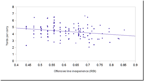
Sanity check #2 is to redo Gandalf's work, but with Reshp's metric. Here's a graph of yards per carry vs. RBI:
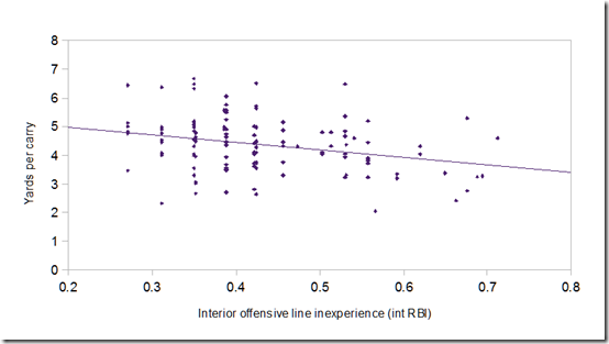
That looks familiar. R2 is .058; the correlation coefficient is -.24 (these coefficients will all be negative because RBI is smaller for more experienced lines). And if we strip out the tackles and just look at the interior?
R2 is .084, the correlation coefficient is -.29, and it's not a coincidence that this looks an awful lot like Gandalf's chart using “youngest interior lineman”.
Weakest link, check. Experience matters more on the interior than at the tackles, check.
Offensive Efficiency
But what I really wanted to do was to look at the impact of o-line experience on an offense as a whole. To do that I've used the offensive component of the Fremeau Efficiency Index, which looks at all offensive drives (except for clock-kills and garbage-time drives) and compares the results to expectations based on the starting field position. By its nature it's pace-adjusted and independent of the effect of the team's defense; they also apply a strength of schedule adjustment.
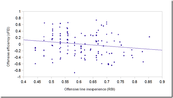
Here's the chart:
R2 is .026, the correlation coefficient is –.16. The effect’s not as large, but a young line impacts the whole offense, not just the run game.
It made some sense that in the running game experience would matter more in the interior than at the tackles since it's an interior lineman that makes the line calls and the assignments tend to be more complicated inside. It wasn't so clear that this would still hold when the passing game was added in:
but that's what we find. The correlation is greater when we only look at the interior. R2 is .048, the correlation coefficient is -.22.
It's on the interior that experience really matters. And Michigan's interior RBI ranks 123rd of 125 FBS teams.
How Large an Effect?
A lot was made in Gandalf's diary, and especially in the comments, about the low R2 values here, which were seen as a demonstration of the relative unimportance of experience vs. other factors, like coaching.
I see it differently. This is an extremely diverse universe of teams we're looking at here. There are differences between Michigan and Eastern, or between Ohio State and Ohio U., that can't ever be overcome by something as simple as inexperience on the line. A lot of the scatter in these charts is just a matter of big programs being big and small programs being small. Given those enormous differences in baseline levels of the various FBS teams it's amazing to me that we could see anything like 5-8% of a performance difference being credited to any one team demographic, especially when the difference is measured using an SOS-adjusted metric like Fremeau.
And the slopes of these trend lines aren't small. The expected oFEI difference between 2012 Michigan and 2013 Michigan is .32; the actual difference is .197. The expectation, just correcting last year's performance for the youth on the field this year, was for a worse offense than we've actually seen.
Put another way, if you use that trend line to adjust for this year's lack of experience, add the missing .32, Michigan's offense goes to 19th in the nation, right behind Stanford and Louisville. UCLA turns into Oregon. Eastern becomes Bowling Green and maybe English keeps his job. Everybody's happy.
Good Teams are All Alike, Every Bad Team is Bad in its Own Way
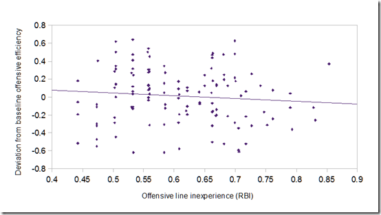
I thought I'd try to get a handle on that by comparing each team's performance to the baseline they've established historically. I've averaged the oFEI's for each program for the five-year period from 2008-2012, then calculated the deviation of this year's performance from that average.
Basically, we're now looking at year-to-year deviations in performance within each program.
On the one hand, this gets rid of the scatter due to the vast discrepancy in baseline performance expectations from the top to the bottom of the division.
On the other hand, this also filters out any effect from programs like Wisconsin whose strength largely comes from the fact that they always field powerful, experienced lines. There's not much year-to-year variance there—they're always old, always good.
So it's possible we won't see any bigger correlation here than before...
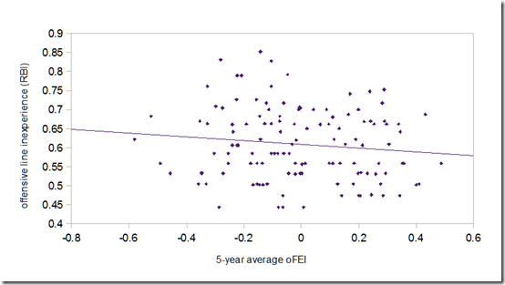
...what happened? R2 is .009. Two-thirds of the effect is now gone. (A result, by the way, that's consistent no matter what metrics I use for line experience.) Apparently, only a third of the effect we’re looking at is a matter of one-off bad seasons due to a young line; most of the effect is systematic, inherent in particular programs. It's almost as if there were a correlation between poor past performance and current youth, and that's because there is:
There's the missing two-thirds. Historically (well, over the last five years anyway) bad teams are on the left, good programs on the right. There's less current youth (lower Bust Index) as you move right.
A look back at the teams listed earlier provides a clue. It's a mix of historically bad programs like Eastern, struggling FCS converts like Idaho, and programs that have suffered some sort of recent calamity, the kind that makes you decide to hire John L. Smith to be your substitute teacher for a year. Some had horrible recruiting, some had retention problems…each one has had its peculiar issues but every one of them is a program in disarray—some recovering, some not. Teams don’t field multiple freshmen because they want to; they do it because things fell apart.
We'll know more if someone does the study suggested in the comments to Gandalf's diary, looking at overall roster depth instead of just the age of the starters, but I think what's happening here is that the Wisconsin effect is the dominant effect in the study. Good programs don't suffer from youth on their lines because (a) it doesn't happen to them and (b) when it does, it's not a sign of weakness. When Andrus Peat finds his way to the top of the depth chart as a sophomore it's because he's beaten out multiple upperclassmen and won the position. When Kyle Bosch find his way to the top of the depth chart it's by default; the juniors and seniors he's supposed to be competing against aren't on the roster.
I think the next thing I might try, if I were of a mind to keep flogging this, is to do something so straightforward and blunt as to look for a correlation between offensive efficiency and the number of scholarship upperclass o-linemen on a roster (more telling than the percentage, I would guess).
